LBG
AWorking in a small team of dedicated designers I worked on 3 concurrent UI Kits for three LBG properties. Lloyds, Halifax and Bank of Scotland. I translated UI designs into Mobile and Tablet and created a UI Kit for each of the properties as UI designs were being continually updated.
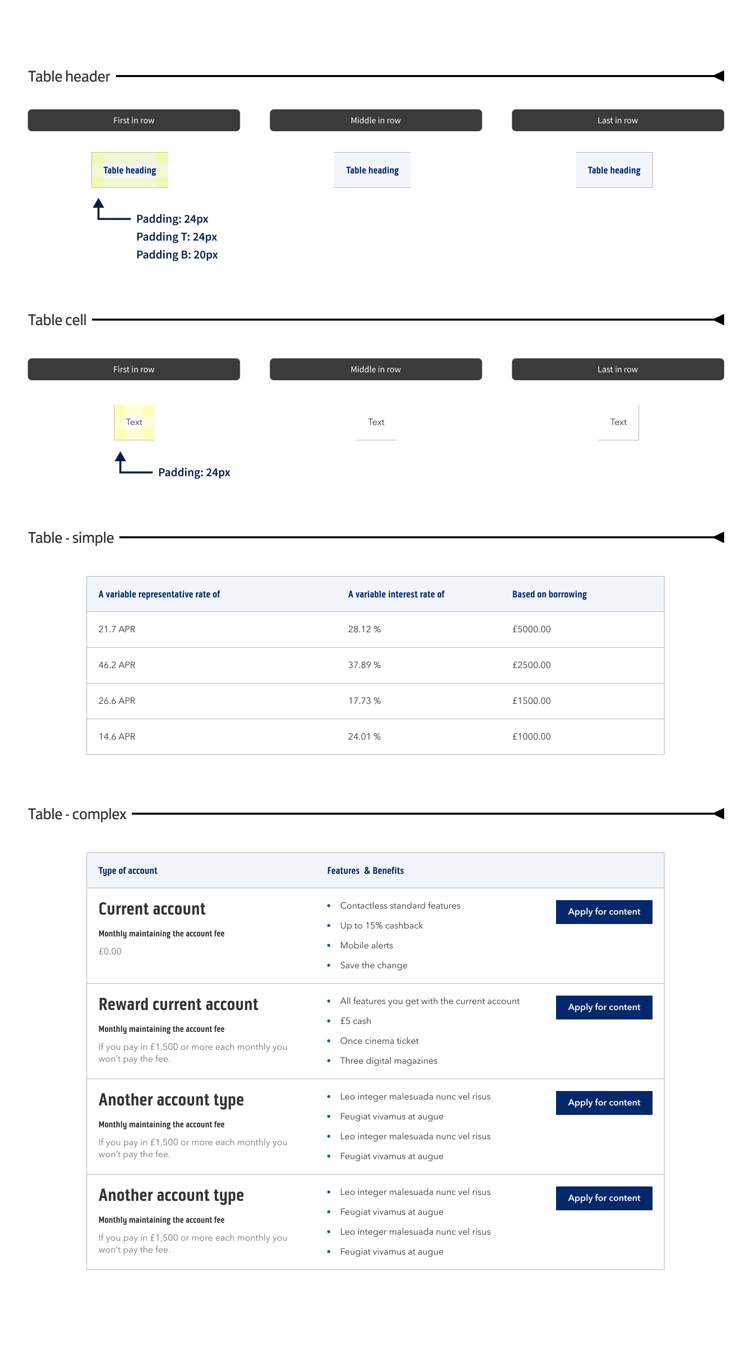
Below I have shown the Bank of Scotland UI Kit as an example. It shows most of the components with their variations and is fully annotated to explain how each component is put together and its relative spacing, padding and margins. All of this information can be gleaned by using inspector mode ( within Figma ) and by simply selecting the component within the kit to examine and switch variants on and off as required.
Tools used for these visualisations included Figma, Photoshop, Illustrator
UI Kit and UI/UX Design for Lloyds, Halifax and Bank of Scotland
-
LGB - BoS
Promo card desktop
-
LGB - BoS
Promo card illustrations desktop
-
LGB - BoS
Promo card enhanced desktop
-
LGB - BoS
Promo card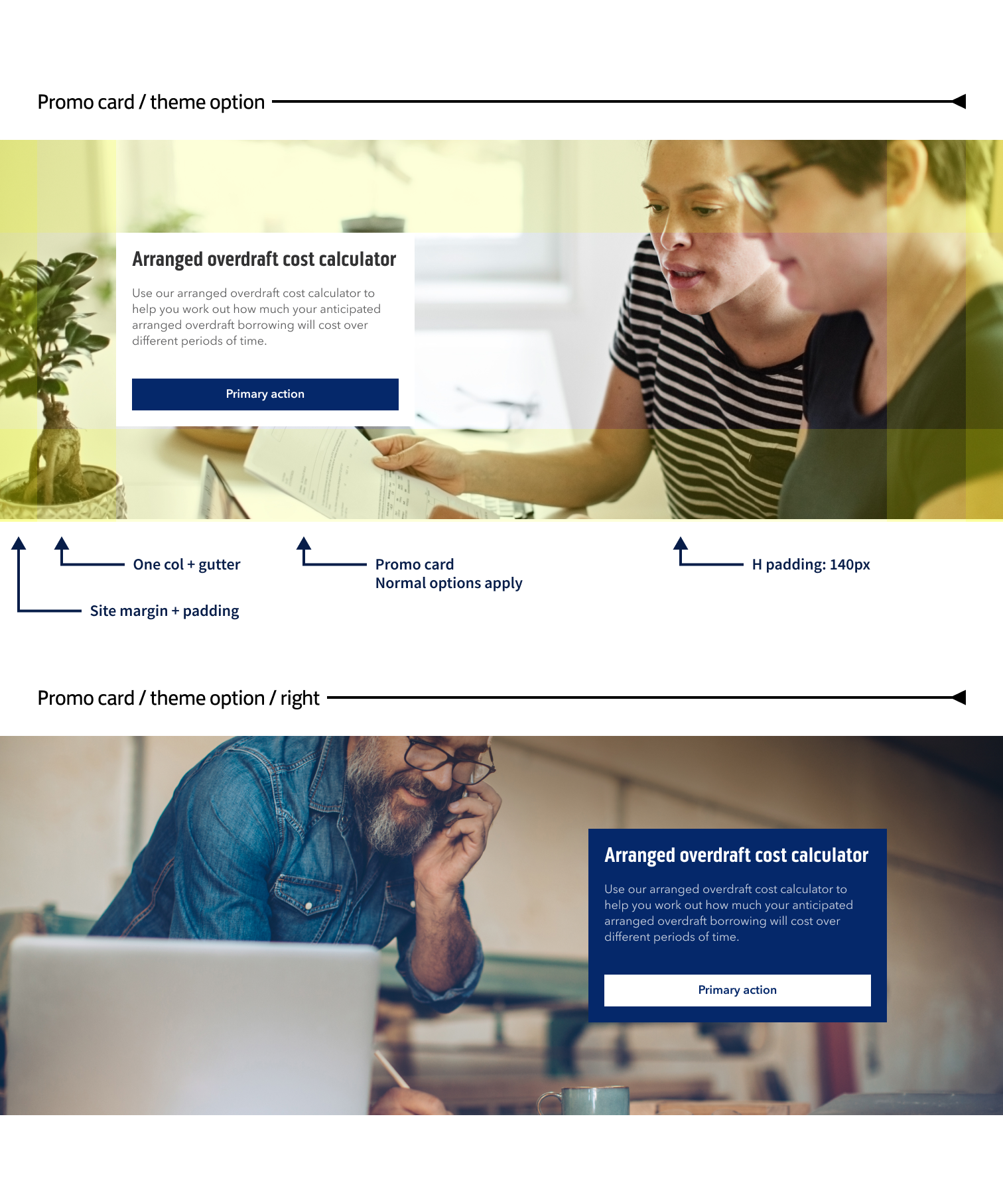
-
LGB - BoS
Promo card 70-30 desktop
-
LGB - BoS
Promo card video desktop
-
LGB - BoS
Hero desktop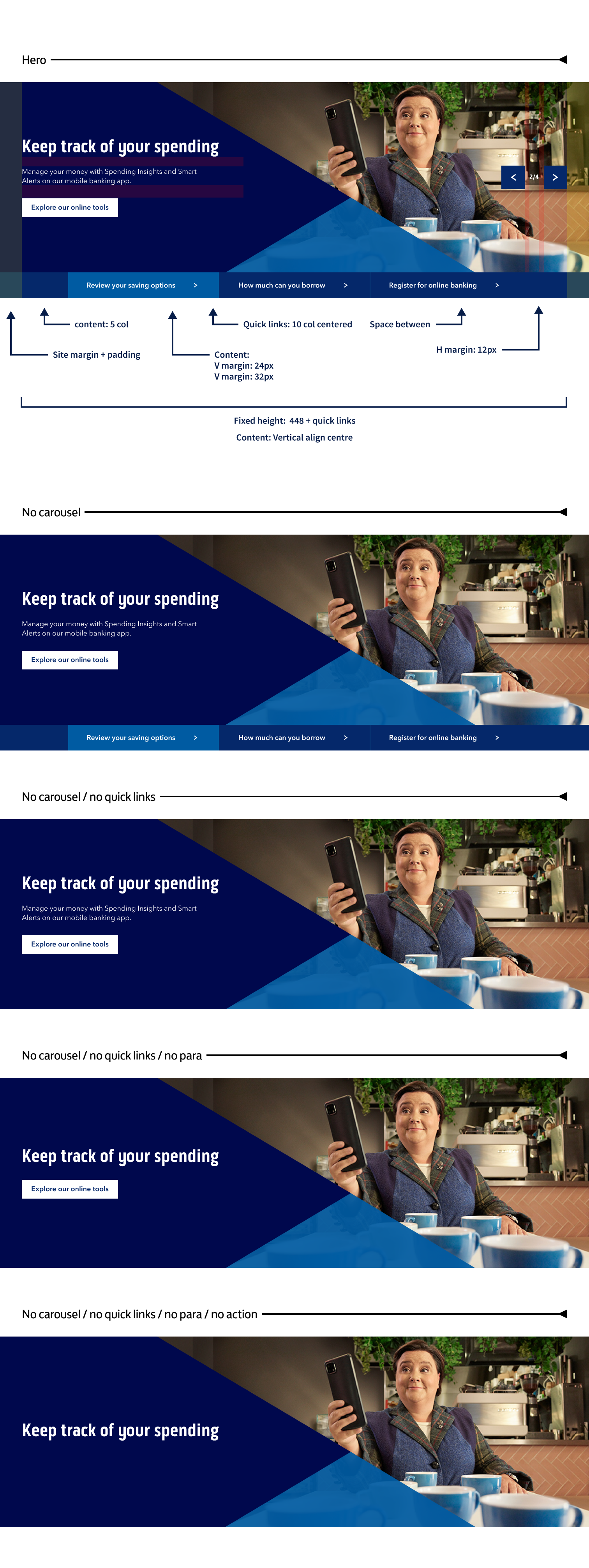
-
LGB - BoS
Promo banner desktop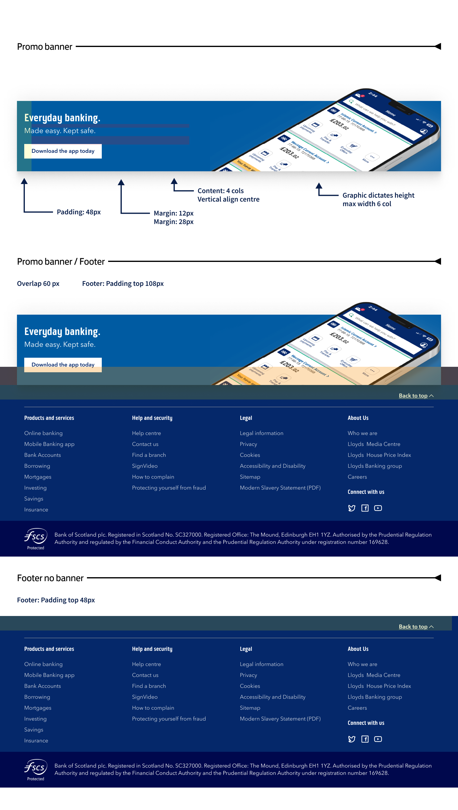
-
LGB - BoS
Text styles
-
LGB - BoS
Carousel desktop
-
LGB - BoS
In page nav
-
LGB - BoS
Accordion + tabs
-
LGB - BoS
Scroll follow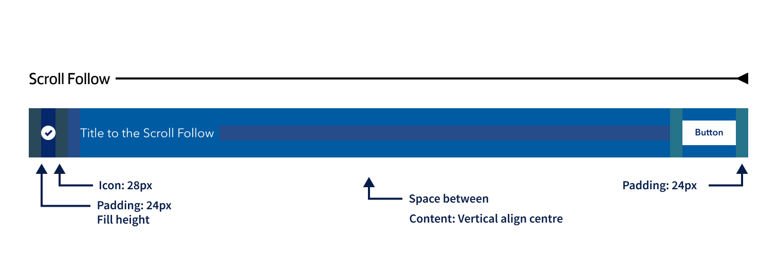
-
LGB - BoS
Document download list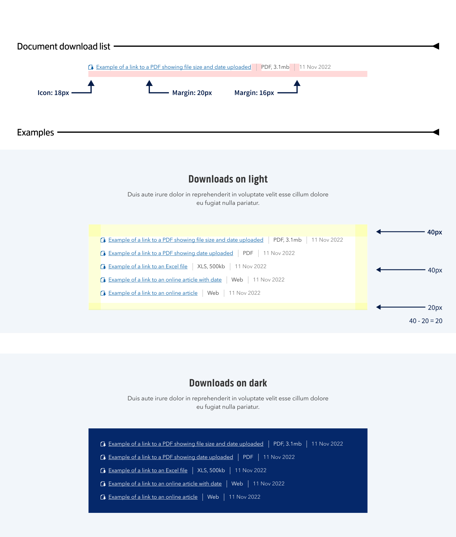
-
LGB - BoS
Adaptive image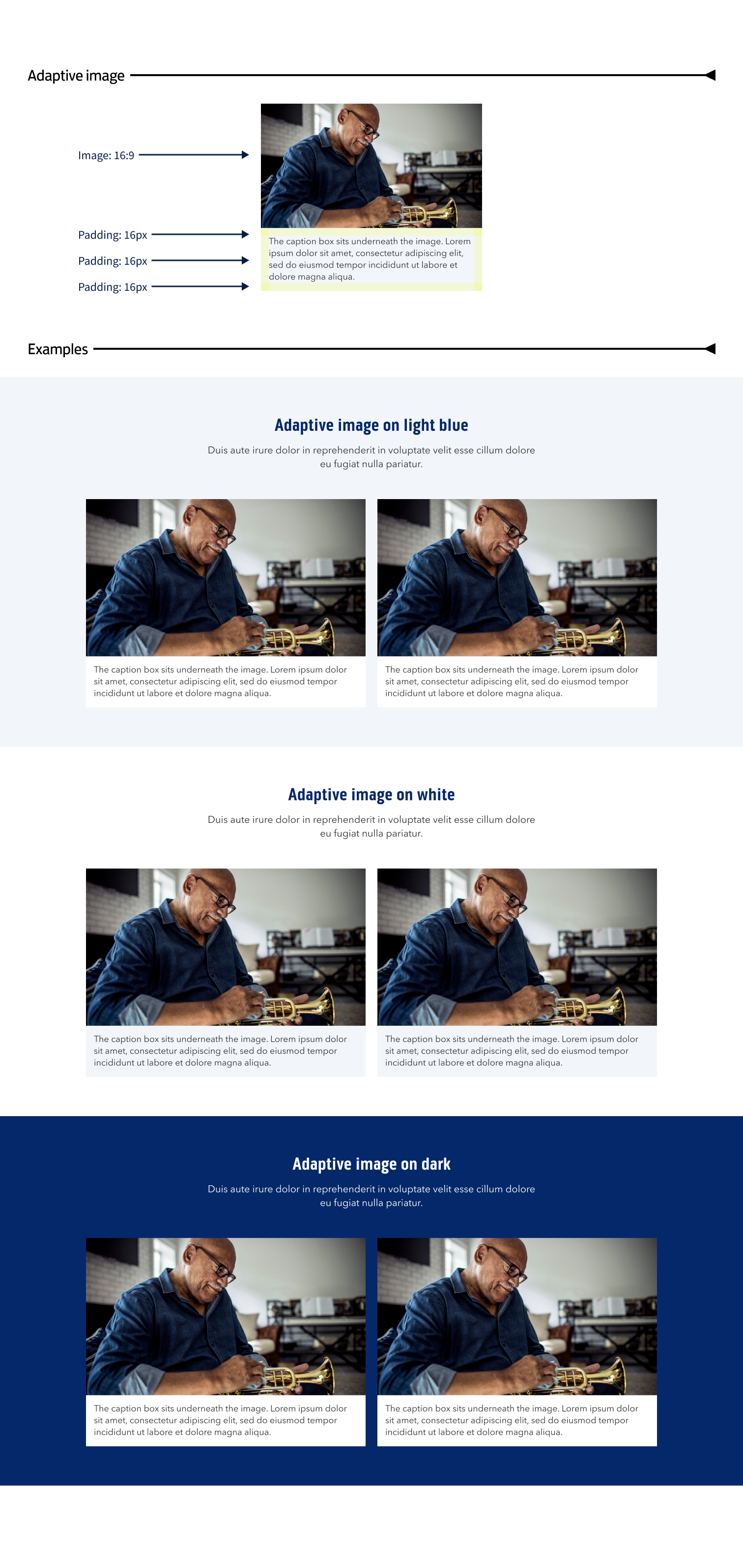
-
LGB - BoS
Cautionary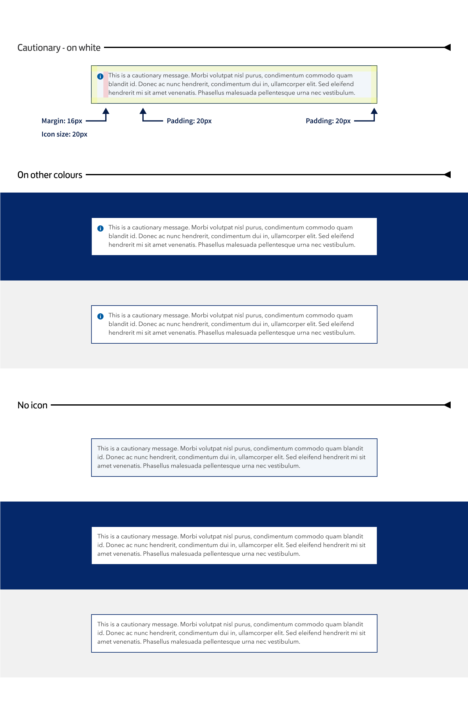
-
LGB - BoS
Anchor List and Details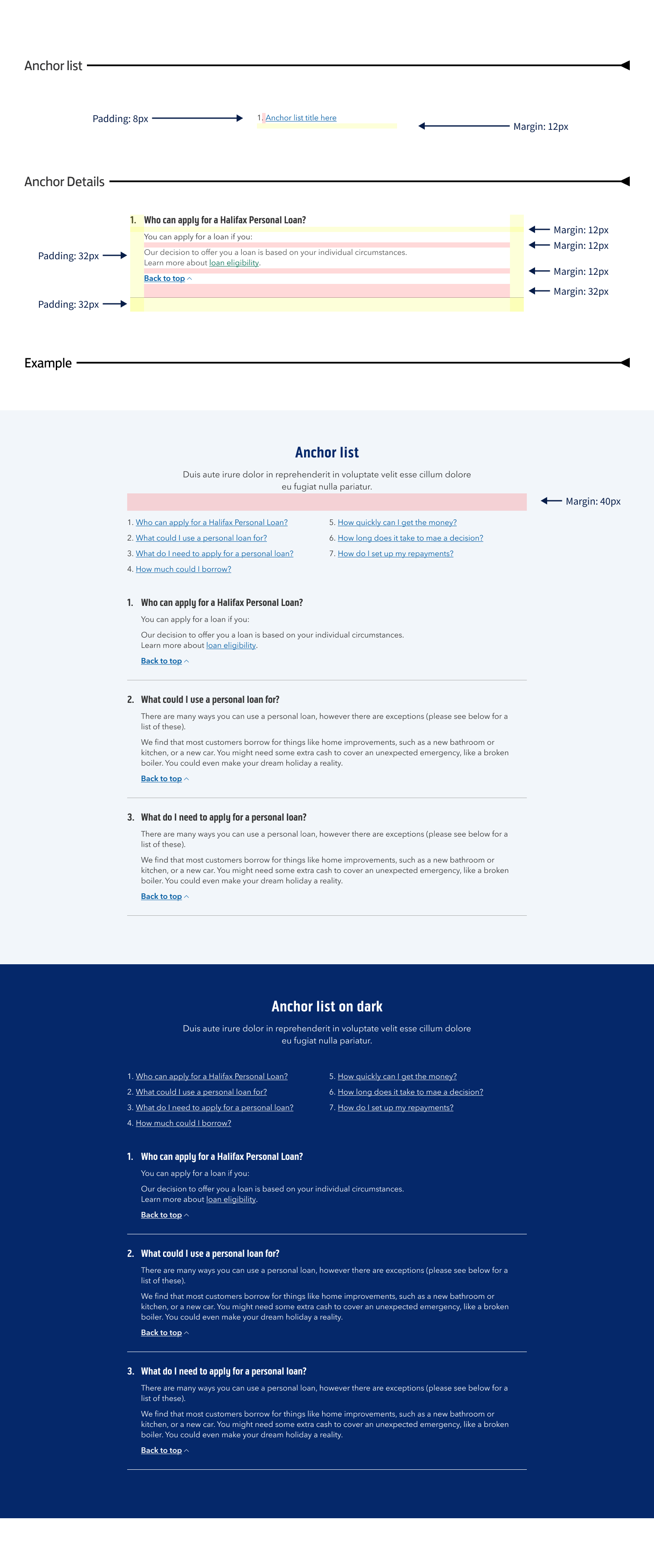
-
LGB - BoS
Product
-
LGB - BoS
19-Table